

The Intiumx brand
How our name, logo, colours, type and products look and sound. Use the files on this page as they are; if you need something that isn’t here, contact us.
Software and cloud services for business.
Intiumx builds and runs the tools a business needs online: hosting, email, meetings, monitoring, tasks and security, all under one HubX account. We are not just a hosting company: describe us with the brand line, then name the product that matters to the reader.
Reliable
Things just work, and we only say so when it’s true.
Secure by default
Safety is built in, never an add-on.
One place
One HubX account, one bill, one support team.
Human
Real engineers, plain words.
Campaign line: Everything your business runs on. · Legal name: Intiumx for Software and Information Technology LLC
One mark: the swoosh and the wordmark
A swoosh that rises over the X, joined to a hand-drawn wordmark with squared ends. It is always used as one piece, from the files below.
 Colour · on white and light tints
 White · on dark and on indigo

 IIII
Clear space
Keep text, edges and other logos at least one height of the letter I away, on every side.
Minimum size
Wordmark: 96 px wide on screen, 25 mm in print. Smaller than that, use the app icon.
Placement
Top left on pages and documents, or centred on covers.
Don’ts
Also: never retype the wordmark in a font, and never set the Intiumx logo and a product logo side by side as one lockup. Apps show their own logo, with a small “by Intiumx” line.
Indigo leads. Night and white give it space.
Mostly white or Night, indigo for the important things (logo, main button, links), and the rest used sparingly. Tap a value to copy it.
Product colours
Each product owns one colour, with a light and a dark partner that make its icon gradient. Product colours stay inside that product.





Four typefaces, each with one job
Headlines in print, social posts and campaigns. ExtraBold for titles, Bold for subheads.
This website, every app and our emails. Regular, Medium and SemiBold.
All Arabic text, paired with Inter for Latin words.
Small uppercase labels, codes and numbers, with wide letter spacing.
Intiumx is the master brand. Products end in X.
Each product logo is the Intiumx swoosh over the product name, drawn in the same letters, in the product’s colour. Download the colour, white or ink version.




























One recipe for every product icon
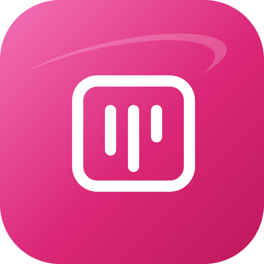
- Tile: rounded square on a 1024 grid, corner radius 232.
- Gradient: light → main → dark, top left to bottom right.
- Swoosh: the Intiumx swoosh in white at 20% opacity.
- Pictogram: one simple white symbol, readable at 32 px.
- Customer and team logos are always shown in a circle in our apps, never a rounded square.
Plain, short and honest.
Short sentences in everyday words. Say what happens and what the reader can do next. “We” is Intiumx, “you” is the customer. Real numbers only when they’re true.
“Your site was slow for 4 minutes at 02:10. We fixed it, and nothing was lost.”
“A transient upstream origin degradation event was mitigated by our edge provider.”
NVIDIA Inception
Intiumx is a member of NVIDIA Inception. Show it only with NVIDIA’s official badge, exactly as supplied.


The badge
- Only the official badge, never recoloured, cropped, redrawn or stretched: full colour or one-colour black.
- On a dark background, place it on its own white tile.
- At least 30 px tall on screen and 6.5 mm in print, with clear space around it.
- Never bigger than the Intiumx logo next to it.
Wording
- “Intiumx is a member of NVIDIA Inception.”
- “Intiumx, an NVIDIA Inception program member”
- “NVIDIA partner”, “Inception” on its own, “Nvidia”, “NVIDIA INCEPTION PROGRAM”
© 2026 NVIDIA, the NVIDIA logo, and NVIDIA Inception are trademarks and/or registered trademarks of NVIDIA Corporation in the U.S. and other countries.
Always start from the master files
Use SVG wherever you can; PNG for chat apps and office files. Never take a logo from a screenshot.